CASE STUDY
ZenKey Onboarding 2.0

PROJECT DETAILS
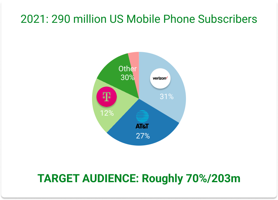
ZENKEY TARGET MARKET
PROJECT DETAILS
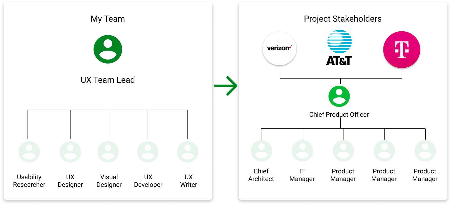
PROJECT TEAM
As the team lead, my task was to assemble my team and deliver a more streamlined and frictionless user experience, while delivering on time and within budget. Working in synergy with the product team, both teams reported our findings and recommendations to the Chief Product Officer.
PROJECT DETAILS
PROJECT TIMELINE
AGILE - 3-WEEK SPRINTS / 12 WEEKS TOTAL = ONE ITERATION
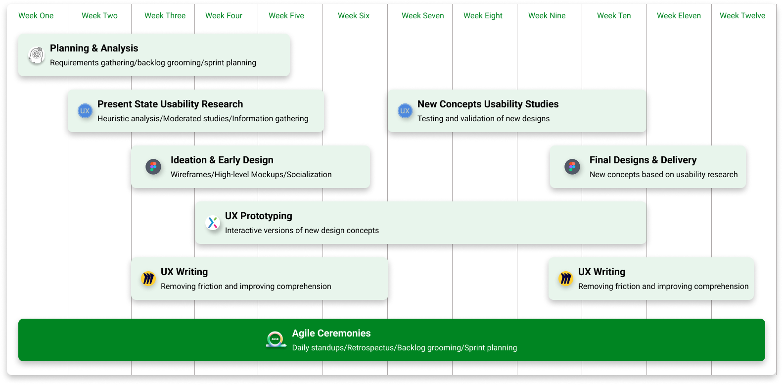
As we only had one 12-week iteration to complete this project, it was important that each project member clearly understood their role and the business requirements. To that end, I setup a customer-vendor relationship between project team members, where one SME would hand off results to the next asap, while working in tandem when appropriate.
PROJECT DETAILS
DESIGN TOOLS

- We used Miro extensively to facilitate whiteboarding sessions, store ideation, and present findings to key stakeholders.
- All research was performed using Userlytics, and we conducted both quantitative and qualitative user testing and usability testing to understand what users wanted and how to match that with business requirements
- Figma was a great tool to help us keep moving. Previously I had overseen the development of our own design system, which gave us that speedy advantage.
- When it was time to test our ideas I worked closely with UX engineers to develop a fully-functional UX prototype in Axure, which we used to in subsequent user testing sessions.
- The entire project was managed by our PM and myself, using Jira and our product backlog.
PROJECT DETAILS
DESIGN PROCESS
Design Thinking
The approach I took was to utilize design thinking so that we could better understand the mental model of our users, ideate a new solution and test whether or not it was the best possible option for the overall user experience.
I also led the timeline management aspect of the project utilizing Agile and scrum in three-week sprints.
PROJECT DETAILS
FRAMING THE PROBLEM

One of the greatest benefits of using the ZenKey online identity app is the unmatched level of security it brings. Your interactions are secured at an unmatched IAL3 level, which utilizes your carrier sim card.
At the same time, the problem that comes with that is gathering enough information from users so that they can have a completely secure experience. This resulted in a lengthy onboarding and registration process that was both cumbersome and confusing, resulting in high abandonment rates.
PROJECT DETAILS
ONBOARDING USER FLOW

End-to-End User Journey

As you can see, just to begin using the Zenkey app, users had to complete a rigorous 12-step process, which required them to provide information that they often didn't remember or didn't know, such as carrier account credentials, email verification from the account holder (perhaps a family member). In addition, some users expressed distrust with the idea of providing biometric information, such as a face scan or thumb print.
DESIGN THINKING - EMPASIZE
RESEARCH OVERVIEW

Research Findings

By utilizing both moderated and unmoderated user testing, coupled with input from the analytics team, we were able to discover the points in the user journey that caused the most friction and make recommendations for ideation from there.
DESIGN THINKING - IDEATION
IDEATE NEW CONCEPTS
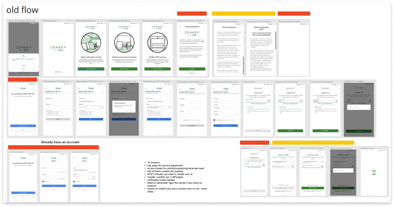
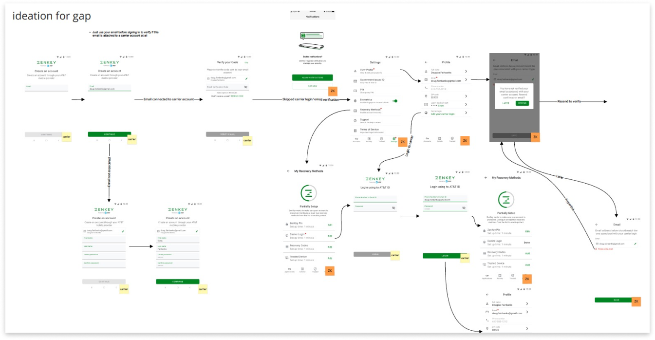
We first began ideating new possibilities by taking an inventory of the existing screens, and working with the Chief Architect were able to identify possible candidates for exclusion in the new flow. This also included an extensive gap analysis exercise, which produced a useful artifact that helped us get to the new design and flow.
Gap Analysis
DESIGN THINKING - PROTOTYPING
PREPARE FOR TESTING
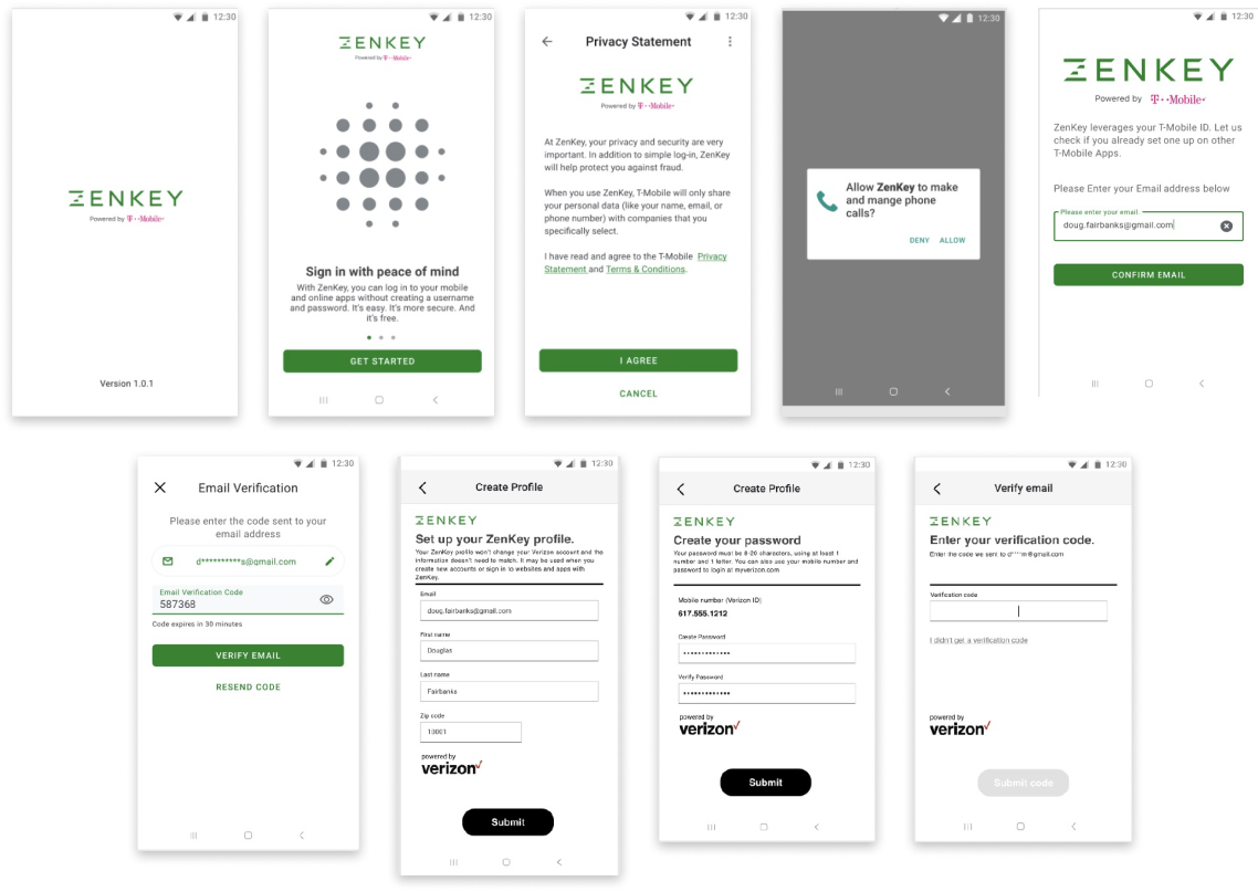
Once the analysis and ideation was complete we tested our hypothesis with prototyping and testing in an additional round of user testing.
DESIGN THINKING - TESTING
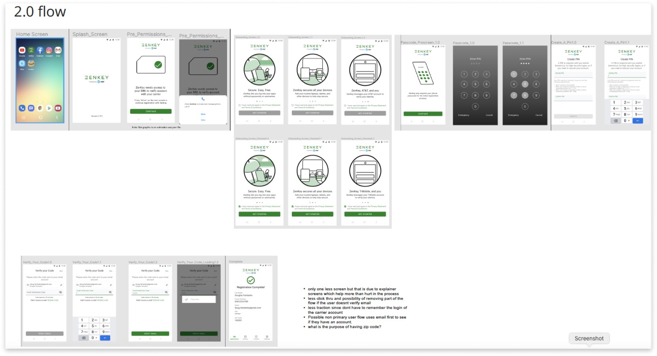
RESEARCH FINDINGS & VALIDATION

DESIGN THINKING - IMPLEMENTATION
IMPLEMENTATION & RESULTS
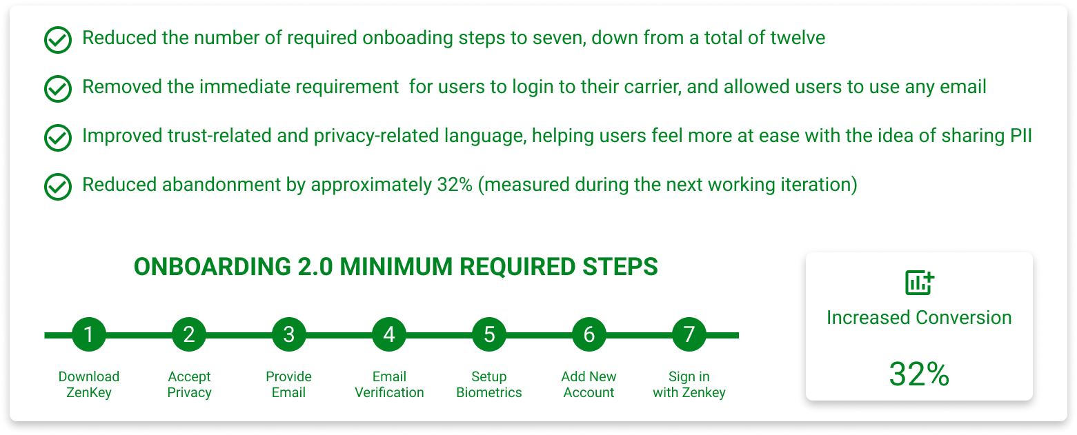
As a result of our combined teamwork, my team and I delivered a much shorter onboarding by shifting to a progressive onboarding experience where users could complete the remaining required steps later after first login and implementation, and increasing conversion by 32%.