PRODUCT DETAILS
WHAT IS POLICY CENTER?
Iron Mountain® Policy Center solution is a cloud-based retention and privacy policy management platform that provides a user-friendly way for users to know legal obligations and show compliance.
With Policy Center users can manage their information through the entire information life-cycle - from creation to use to disposition.
PRODUCT DETAILS
TARGET MARKET
The Iron Mountain Policy Center is designed to cater to various types of businesses with different needs for record retention and policy management. This includes businesses such as healthcare institutions for patient record storage, financial services for data storage and compliance, legal firms for document management, and government agencies for secure data storage. They also serve the retail and manufacturing sectors for inventory and data management, the energy sector for geological data storage, and the media and entertainment industry for archiving digital and physical media. Their range of services encompasses data backup and recovery, document storage, secure shredding, and data centers.
PRODUCT DETAILS
FRAMING THE PROBLEM
Users face challenges with slow search speeds, cumbersome search functionalities, and limited customization options. These issues hinder efficient information retrieval and personalized user engagement. The goal is to redesign the user experience to significantly improve search speed, simplify search functionalities, and enable user-specific customization.
PROJECT DETAILS
PROJECT TEAM
My Role: As the Lead Usability Researcher and Principal UX Designer, my task was to design a user-friendly interface that would boost productivity and lessen the user's cognitive burden. Additionally, I crafted three separate and practical UX models and performed a usability test with a chosen group of users to evaluate their efficiency.
The Iron Mountain Policy Center UX project was spearheaded by the Senior Marketing Director, who provided visionary leadership and strategic direction. Working closely with him was our Product Manager, responsible for aligning the product's features with market needs. The technical backbone of the team consisted of a Senior Front-end Developer and a Senior Back-end Developer, both of whom ensured seamless functionality and robust architecture. Adding a layer of intelligence to our architecture was a Data Architect. The design ethos was shaped by myself, the Principal UX Designer, who focused on user-centric solutions. Rounding out the team was our Copywriter, who crafted compelling narratives and ensured clarity in all user-facing text
PROJECT DETAILS
PROJECT TIMELINE
AGILE - 3-WEEK SPRINTS / 24 WEEKS TOTAL = TWO PROUCT ITERATIONS

Sprint 1: Research & Planning (Weeks 1-3)
- Week 1: Conducted user interviews and surveys to understand pain points.
- Week 2: Analyzed existing data and metrics.
- Week 3: Developed user personas and journey maps.
Sprint 2: Ideation & Prototyping (Weeks 4-6)
- Week 4: Brainstormed sessions for feature improvements.
- Week 5: Developed low-fidelity prototypes.
- Week 6: Conducted usability tests on prototypes.
Sprint 3: Development - Iteration 1 (Weeks 7-9)
- Week 7: Frontend development team Implemented frontend improvements for speed.
- Week 8: Backend development team optimized for search functionalities.
- Week 9: Entire development team Initial implementation of customization features.
Sprint 4: Testing & Feedback - Iteration 1 (Weeks 10-12)
- Week 10: Conducted A/B tests with the pilot group for speed improvements.
- Week 11: Collected user feedback on search functionalities.
- Week 12: Analyzed data and prepared for the next iteration.
Sprint 5: Development - Iteration 2 (Weeks 13-15)
- Week 13: The development team refined the front end based on feedback.
- Week 14: The development team optimized the backend based on analytics.
- Week 15: The entire inalized customization features.
Sprint 6: Testing & Launch (Weeks 16-18)
- Week 16: UX conducted the final round of A/B tests and user feedback.
- Week 17: Made last-minute adjustments and code freeze.
- Week 18: Prepared for launch and completed documentation.
PROJECT DETAILS
DESIGN TOOLS

- Both qualitative and quantitative UX research was performed using Userlytics
- Figma was the base design app. We leveraged Iron Mountain's brand book to guide us with correct styles
- During testing, I collaborated with UX engineers to create a functional UX prototype in Axure for subsequent user sessions
- The PM and I managed the project using Jira and a product backlog
PROJECT DETAILS
DESIGN PROCESS
Design Thinking
I applied the principles of design thinking to comprehend our users' mental models, devise novel solutions, and evaluate them in order to ameliorate the user experience as a whole.
I also led the design thinking of the project utilizing Agile and Scrum in three-week sprints. This also included all discovery, including usability testing, prototyping, and UX recommendations.
PROJECT DETAILS
RESEARCH OVERVIEW
Who
- A Mix of nine client users
- Five account managers
- Four records technicians
What
- Quantitative usability testing
- Qualitative user testing
- Focus Groups
Where
- Remotely administered utilizing Zoom
- Remotely proctored using Google Forms
Research Findings
DESIGN THINKING - IDEATION
Ideating a Better User Experience
User Flows
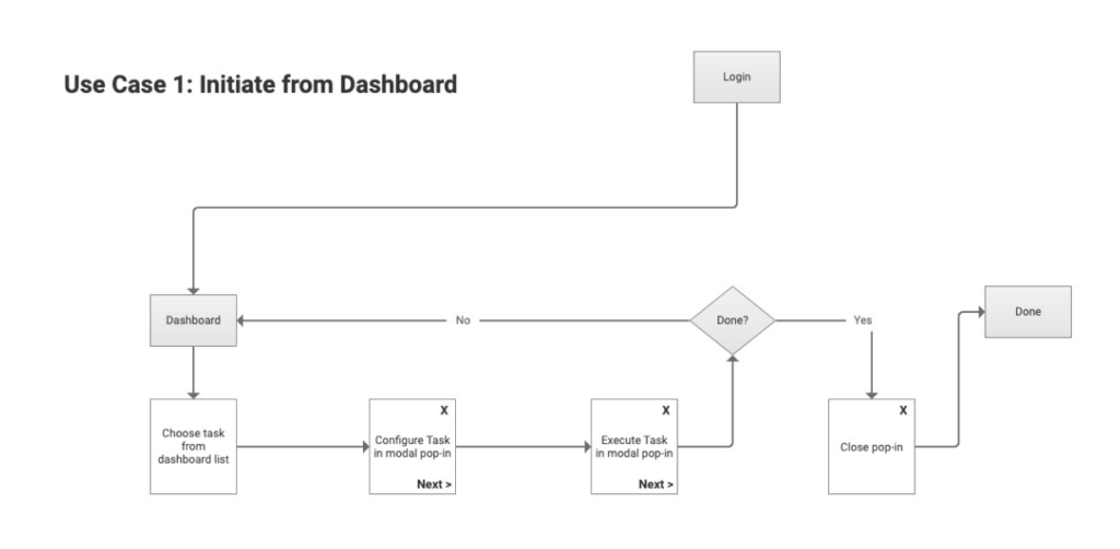
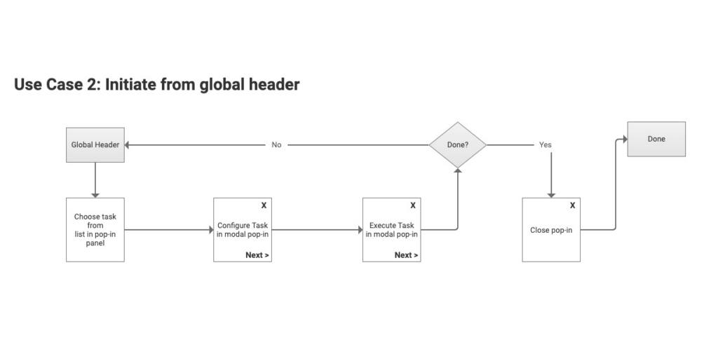
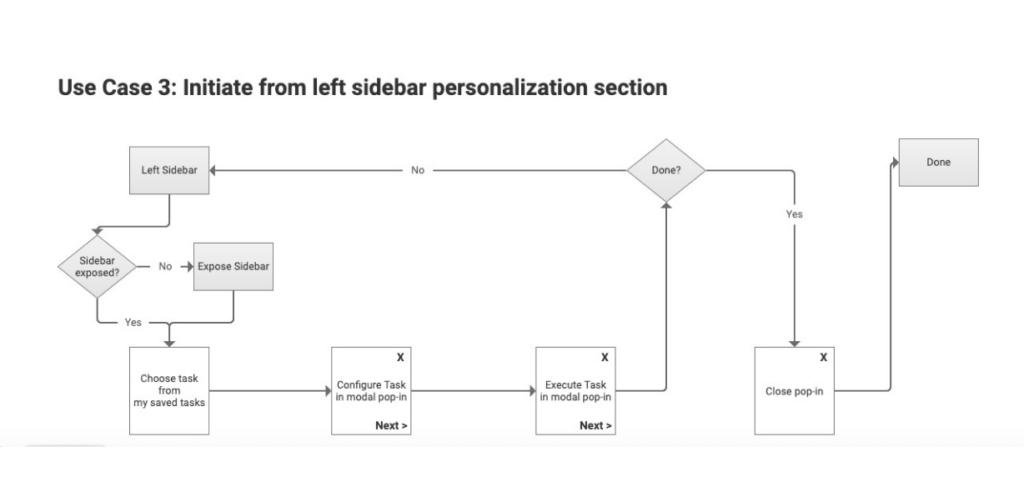
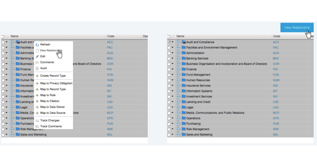
Below are some examples of how the new user experience would look like from a flow perspective. The idea here was to give users flexibility while increasing their efficiency and lowering their cognitive load by creating a seamless starting point in their journies.
Guided Tasks Flows Examples
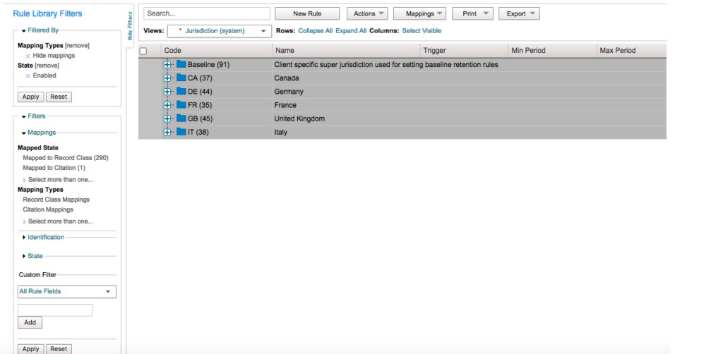
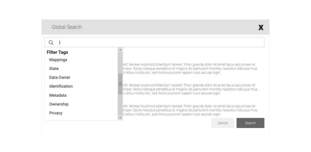
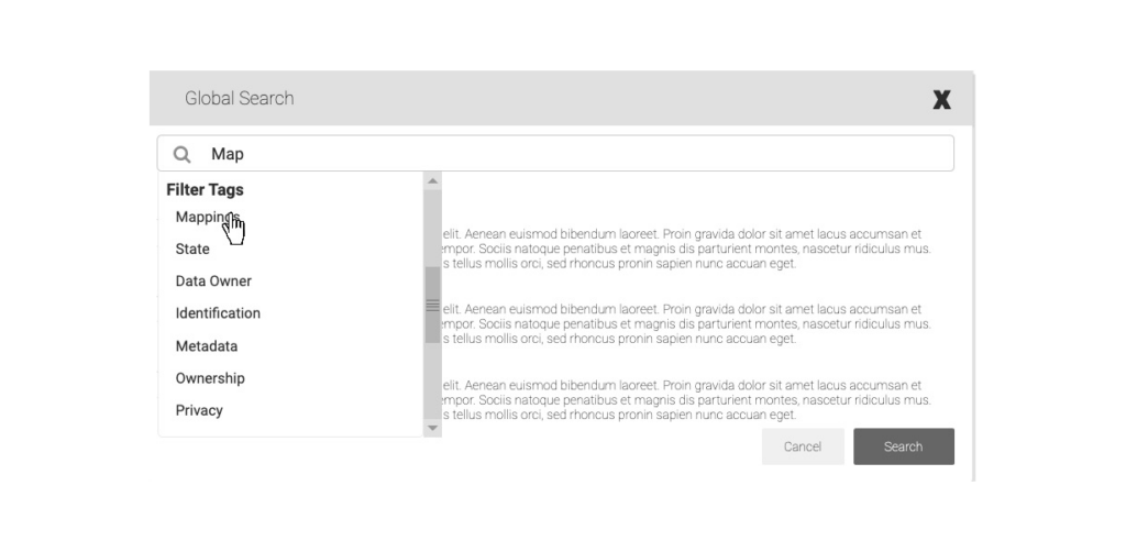
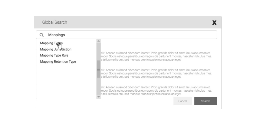
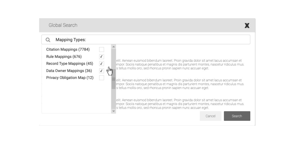
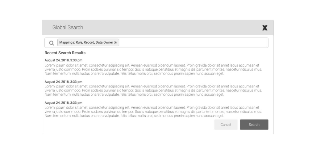
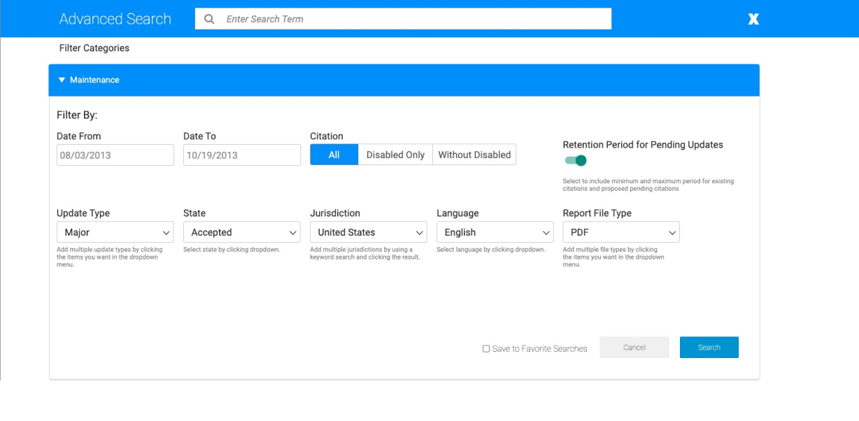
Search & Filtering Concepts
Reduced Cognitive Load
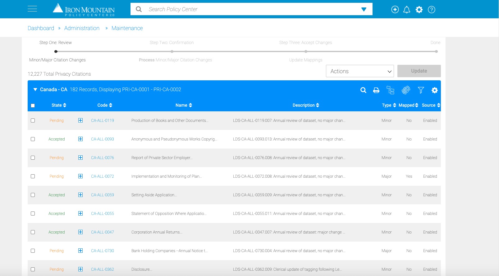
One of the problems that was uncovered during usability testing was that users struggled with navigating the multiple layers of citations and rules engine due to the complexities of the hierarchies involved. We therefore implemented a guided left navigation structure that reduced the cognitive load on users by providing them with a clear and concise path to their desired content or functionality. This was especially beneficial given the complex nature of the application where users may need to filter through a large amount of data.
Improved Efficiency
By providing users with tools for complex filtering, the guided left navigation & faceted global search helped them find the information they needed more quickly and efficiently. This adds up to big cost savings over time because it reduces time on task. This can be especially beneficial for users who need to perform complex tasks on a regular basis.
Increased Engagement
The guided left navigation helped to increase user engagement by providing them with a sense of progress and accomplishment as they moved through the application flow. This is because users are able to see how close they are to completing their task and they can track their progress along the way.
Prototyping New Paradigms
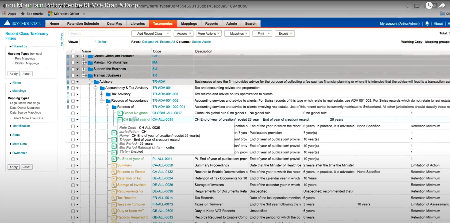
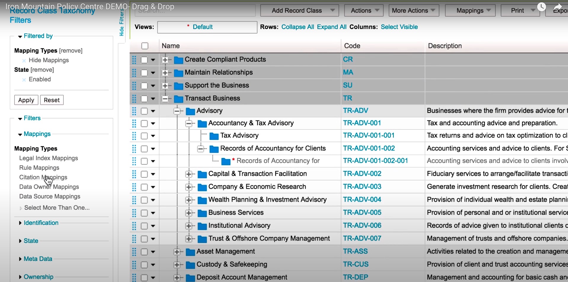
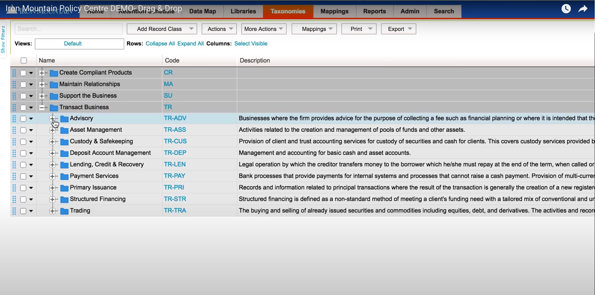
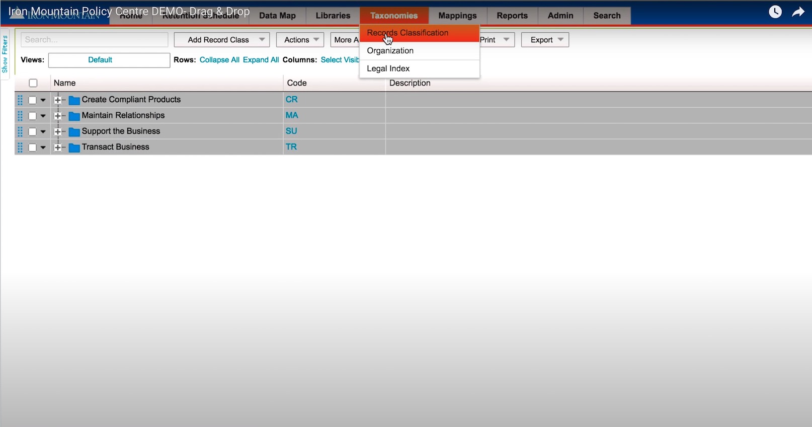
We implemented a tree-based hierarchy that allowed for easy selection and record maintenance. This new paradigm helped users to move faster within their search results and complete tasks more efficiently.
DESIGN THINKING - IMPLEMENTATION
IMPLEMENTATION & RESULTS
Goal #1 was to improve user perception of page loading speed with loading indicators and feedback. The results were impressive, with 70% of users commenting favorably about the decrease in application load time. This significant reduction indicates that users found the platform considerably easier to understand and navigate, leading to a more seamless interaction with the system. Faster page loads and clear indicators likely contributed to a less stressful experience, allowing users to focus more on their tasks rather than waiting for pages to load.
Goal #2 aimed to enhance the user experience by implementing best practices for product usability. The team utilized strategies from the Laws of UX, a collection of best practices that blend psychology and design principles to create more user-friendly interfaces. By adhering to these laws, the team was able to create a more intuitive and accessible platform, which likely contributed to a more satisfying and effective user experience.
Goal #3 focused on providing a personalized experience by offering a custom dashboard, saved searches, custom lists, etc. The outcome was a more flexible system that increased efficiency by 36%. This level of personalization means that users could tailor the platform to their individual needs, streamlining their workflows, and reducing the time and effort required to manage their information lifecycle.
