IRON MOUNTAIN POLICY CENTER
Law Professionals Needed an Easier Way to Maintain Citations
Project Summary
PROJECT DELIVERABLES
UX Prototyping with Axure RP
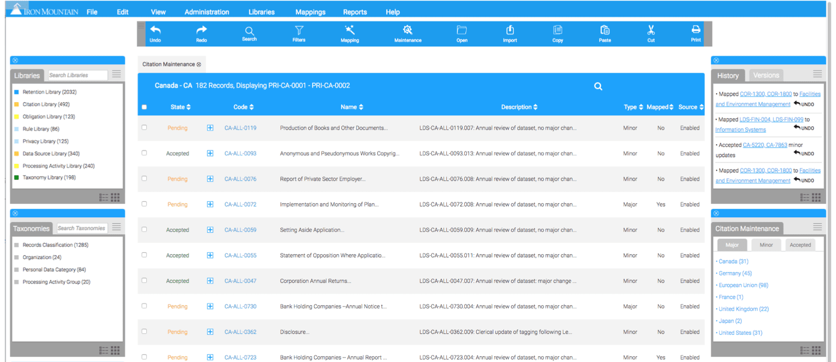
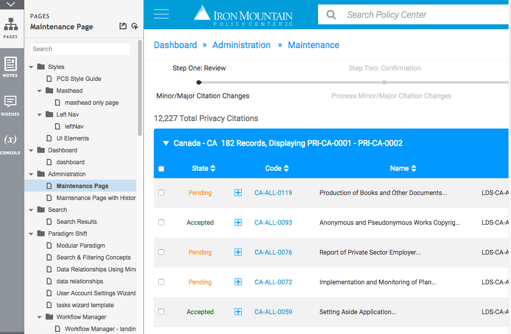
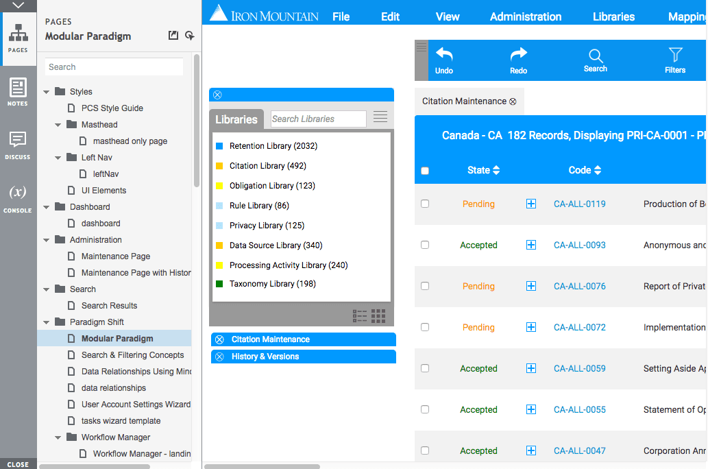
Project stakeholders wanted to see how my UX concepts and improvements would translate into a functioning application. The request was to create a high-fidelity UX prototype that could be shared with other members of the management team as well as select users a before/after usability test. I utilized my advanced skills in Axure RP 8 to create a dynamic, logic-driven interactive clickthrough of approved UX patterns and designs from the previous stage in the project.
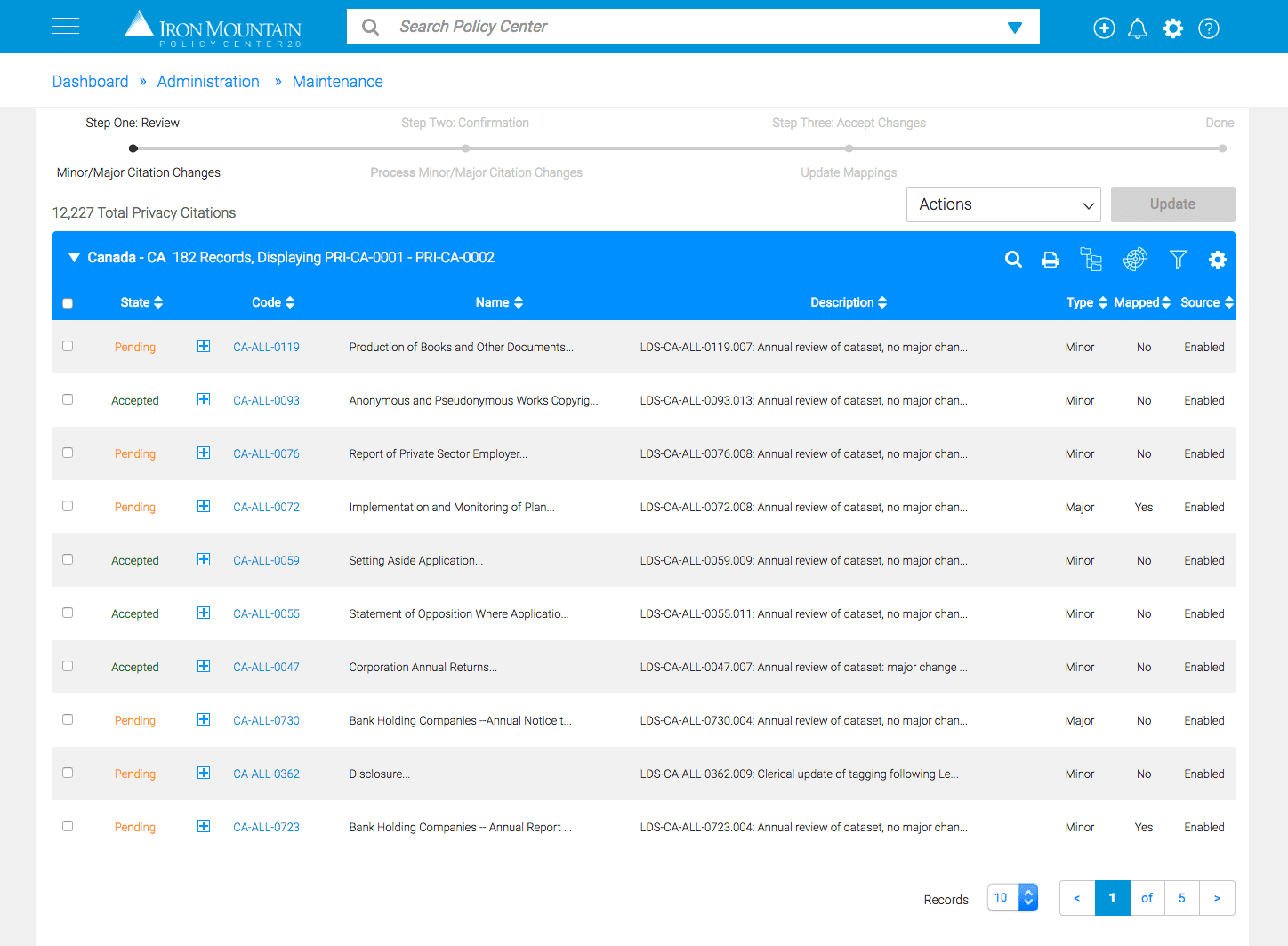
Protoype Concept One
With Concept One, the problem we are trying to solve was findability and discreet sorting. Concept One addresses this problem by providing inline filtering patterns and granular-level data settings that users could utilize as saved preferences.
Protoype Concept Two
With Concept Two, the problem we were trying to solve was the lack of flexibility presented in a standard grid/table-based data visualization. Concept Two allows users to drag and drop, place content where they want it and display specific categories of content as to their liking.

Usability Research
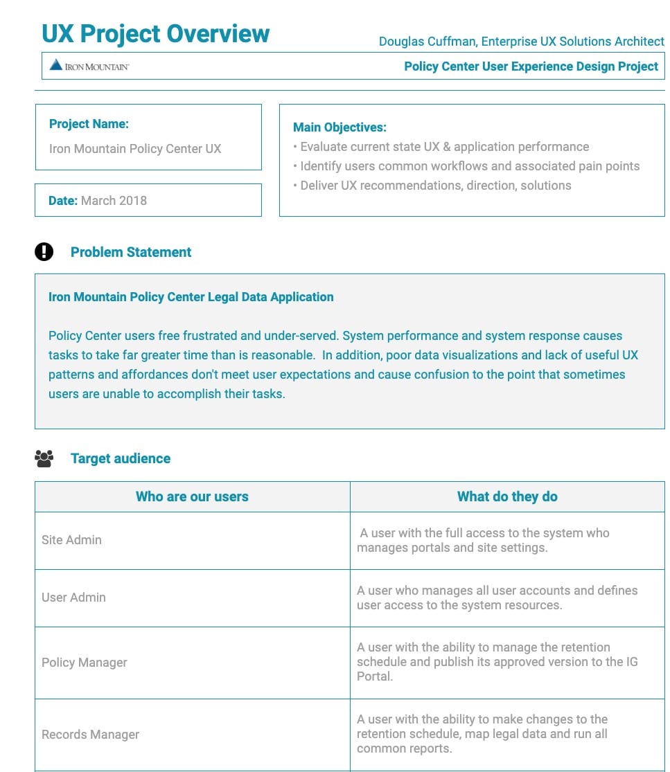
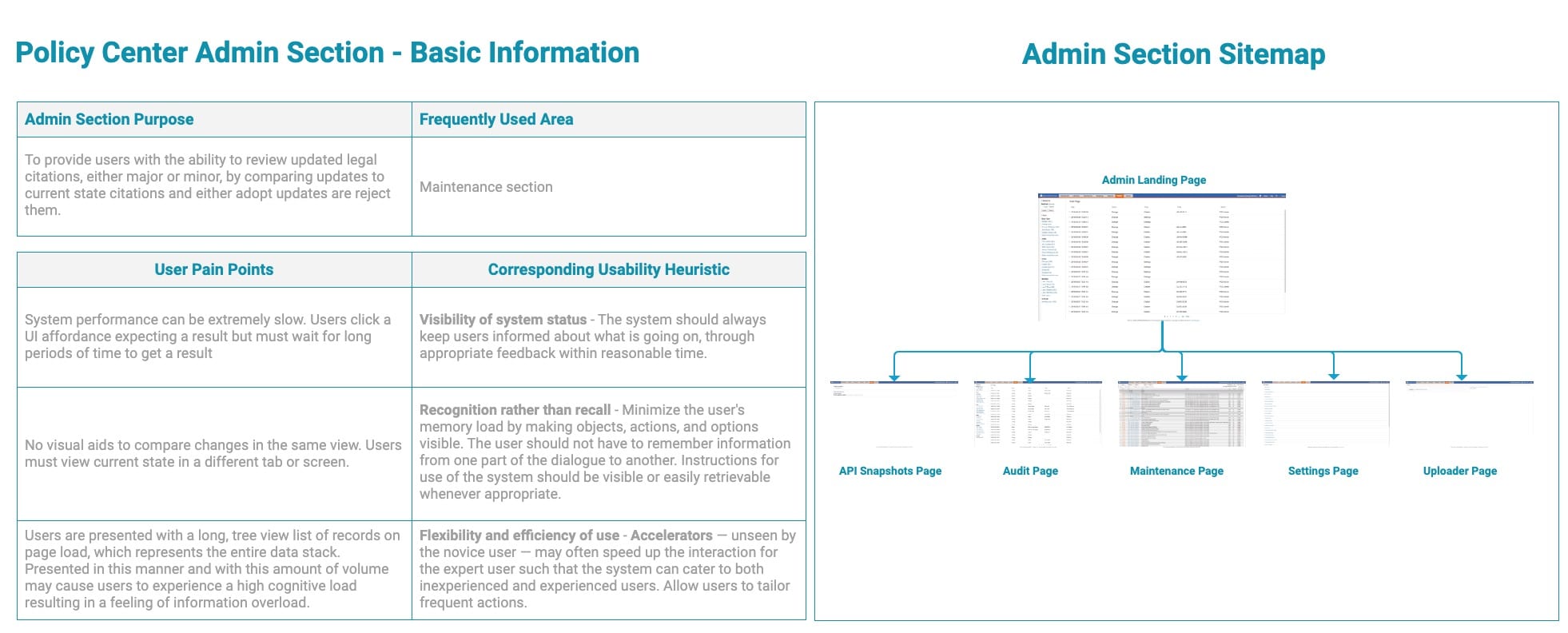
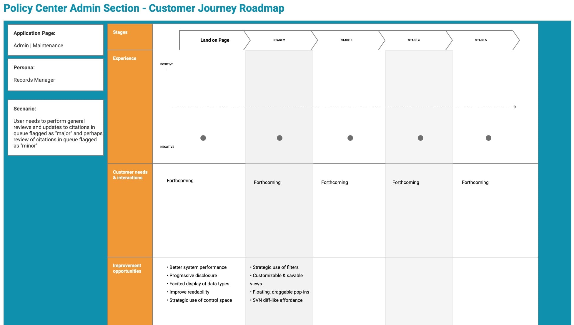
Prior to developing the new user experience, it was critical to understand the application current state and user's pain points. We set up both an online survey and user interviews, where we queried users about their experience and opinions on application functionality and system performance as it relates to their individual user experiences. The deck below is a report on our findings, including recommended next steps and changes to the user interface and design.
Usability Research Report
UX Recommendations
This deck is a continuation of the new effort to implement fresh and useful UX patterns. This deck specifically addresses complex data visualizations from a parent-child-sibling relationship spanned across multiple categories.
User Flows in a Tasks Wizard Concept
The purpose of this deck was to illustrate to project stakeholders how a wizard-based user flow could remedy confusion and increase data quality.
